
You type in an address, a blue dot appears, and a route is drawn automatically on the screen. Nothing seems more objective than that trace: the Earth viewed from above. Yet every name, every border, and every path that appears (or does not) is the result of a chain of human and computational decisions that we rarely notice.
A digital map is not a window: it is a chain of decisions
To understand why a map is never neutral, it helps to distinguish three layers. The first is the projection, the mathematical method that transforms the planet’s curved surface into a flat image. The second is the database, which collects names, roads, borders, and places. The third is the visualization algorithm, which decides what to show, with what priority, and at what scale; in navigation applications, route calculations, traffic, and estimated times are added.
This division matters because cartographic bias is not purely geometric. A projection can exaggerate the size of a continent, but it can also happen that a toponym, a path, or a business does not appear because no one has incorporated, validated, or licensed it. The map does not merely distort: it also selects.
Hence the thesis running through this article: the bias in digital maps has not disappeared when moving from paper to screen; it has been automated. The relevant question is no longer which projection is the true one, but which criteria decide which territory is visible and which is left out.
Mercator versus Equal Earth: what each map preserves and distorts
The debate begins in the sixteenth century. In 1569, Gerardus Mercator published a conformal cylindrical projection, which preserves angles and bearings. It was a boon for navigation because it allowed drawing a straight line and maintaining a constant course. That design, however, greatly exaggerates areas near the poles.
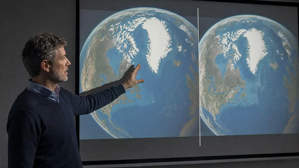
The result is a world image that many of us have internalized without question. In Mercator, Greenland can appear comparable in size to Africa, when in reality Africa is roughly 14 times larger. The distortion is not an error, but a logical consequence of the property Mercator chose to preserve: navigating without losing the bearing.
Against that model appeared Equal Earth, presented in 2018 by Bojan Šavrič, Tom Patterson and Bernhard Jenny. It is an equal-area projection, which preserves the relative surface proportions between regions. In return, it distorts shapes, angles and distances, especially toward the edges. It is designed for thematic world maps, not for guiding a car through a roundabout.
There is thus no universally correct projection. Each one optimizes a different property and sacrifices the rest according to the purpose. If we change the projection, we change the question the map allows us to answer.
How to read a comparison: the legend that almost never appears
When you see an image that pits both projections against each other, it helps to read it with a simple key. Mercator preserves angles and bearings, so it is reliable for orientation, but distorts areas at high latitudes. Equal Earth preserves relative areas, so it compares the sizes of regions more fairly, though it alters shapes, angles and distances.
A good comparative cut should include a high-latitude area, such as Greenland, and an equatorial reference, such as central Africa. This debate leapt from the technical to the political realm on September 4, 2026, when the UN General Assembly adopted the resolution A/RES/80/307 (by 164 votes in favor, 1 against and 6 abstentions), encouraging the use of equal-area projections when comparing regional surfaces. The recommendation does not ban Mercator nor change borders, sovereignty, or any jurisdiction.
The digital map: who contributes the data and who decides what is prioritized
Here is where bias becomes invisible. Google Maps, Apple Maps and OpenStreetMap do not operate the same, and that difference conditions what we see. The first two are commercial platforms; the third, a collaborative geographic database that is then represented through different programs and styles.
Google Maps, according to its official documentation, integrates data from public authorities, cartographic organizations, geospatial partners, and user contributions: addresses, points of interest, roads, trails and political and postal boundaries. The company reviews partner data and can cross-check them with satellite imagery and Street View, though it warns that not all submitted content is published. The presence of a place depends not only on its physical existence, but on whether it is documented, licensed, validated, and integrated.
Apple Maps offers channels to report incorrect addresses, missing businesses, transit stops or navigation issues, and evaluates traffic alerts by showing or removing markers when a sufficient level of confidence is reached. The documentation describes the mechanism, but does not publish numerical thresholds or the algorithmic model, which leaves much of those decisions out of public scrutiny.
OpenStreetMap feeds on local knowledge, GPS traces, on-the-ground observations, and images or data sets with appropriate licensing. It also supports institutional imports, provided licenses are checked, the process is documented, and the affected community is consulted. Its essential difference from commercial platforms is not that it lacks filters, but that its editing rules and dispute mechanisms (in some cases managed by the Data Working Group) are more visible. Comparing platforms requires fixing coordinates, language, zoom level, and search type, because the same place can be presented with different criteria.

The lived territory: names, paths and borders that don’t always fit
Why doesn’t my neighborhood appear? The question is more revealing than it might seem, and there are many possible answers before suspecting deliberate erasure. The absence of a place can be due to insufficient licensing, an outdated source, a lack of validation, a particular visualization scale, linguistic differences, or that the element does not fit the platform’s commercial categories.
Local roads illustrate the problem well. A seasonal-use path or a route known to a community may be left out of a commercial app because it lacks verifiable data or is not suitable for the intended navigation. OpenStreetMap can document it if there is on-the-ground evidence, but that information is not automatically transferred to commercial maps.
A awkward question thus arises: what local knowledge is not being translated into data that platforms recognize?
With borders, extra caution is warranted. The way a map draws or labels a boundary is cartographic representation, and should not be confused with legal sovereignty, that is, who actually holds jurisdiction over a territory. A toponym may be recognized by an administration, used daily by the local population, and yet appear differently or not appear on a platform. Distinguishing these two levels prevents attributing to an algorithm decisions that belong to international law, and vice versa.
All of this yields a sober conclusion: the map we carry in our pocket is not a transparent window to the world, but a construction with authors, sources, licenses, and priorities. Knowing how to read its layers — projection, data, and algorithm — is today a form of literacy as essential as knowing how to orient yourself with the blue dot.